Saturday, 17 October 2009

Image & Collage


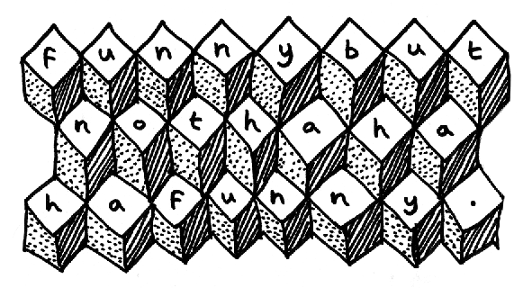
As this handy diagram demonstrates, THOUGHTS, IMAGES, WORDS, and TEXT are all inter-linked. Sounds obvious, though I can't claim it's something I've ever sat down and thought about. We looked a little deeper into the idea using several examples of collage, and by making some of our own.

In addition to the examples of noted collage artists provided by Darren - Alexandr Rodchenko, John Heartfield, Hannah Hoch, Alan Fletcher, Alex Williamson, Sara Fanelli, Martin O'Neil, I've chosen an examples by 10 other contemporary collage artists, one for each of the following themes. While found tonnes of work I liked, it was very very difficult to decide which category to put the examples in. I'm not even sure that my final choices were correct, but it certainly got me thinking. Click on the name for a link to the work.

Collage Themes:
COMPOSITION // James Dawe
EDITING // Hubert Blanz
CONTRAST // Valero Doval (Ghosts)
RHYTHM // Are Mokkelbost
TEXTURE // Hilary Pecis
REPURPOSING // Valero Doval (Aerofauna)
JUXTAPOSITION // Mary Virginia Carmack
SURREALISM // Andreas Banderas
NARRATIVE // Devin Troy Strother
HUMOUR // Anthony Zinonos

And surplus to the list, but worth a mention - Ian Monroe (pictured), Mario Wagner, Seth Curcio, Bill Zindel, and Christiana Couceiro.

Okay, now the work we made during last week's session. Here are three rather creaky 10-minute collages that I created, each one in response to a particular theme:

EDITING: The removal of the central figure from the image, in this case also the focus of the focus of the other figures, creates an ambiguity: are they helping or restraining the figure?


EDITING again: here the removal of a background of limousine interior and foreground details of champagne glasses, combined with the repositioning of the of the two figures nose-to-nose, explores the ambiguity of the celebratory/violent nature of the image.

SURREALISM: With conscience and temptation on each shoulder, here's Top-ranking UK Scrabble enthusiast David Webb. David's top tip - "Qinghaosu", an "anti-malarial medicine made from the mugwort”, apparently.


Finally, here's my series of collages produced in response to a brief of "as many as you can in 20 minutes". To speed things up I chose to create an A-Z series, with each single letter taken from the large headlines of an issue of the Telegraph, and the corresponding words from the sub-headlines of the same paper. With content and layout repeated across each collage, the process became automatic, with my own decision-making limited to the first few few minutes of the task. Even the words chosen to represent each letter were largely chosen according to their availability. The result: 20 complete collages, or 1 per minute. Almost a full alphabet!

Wednesday, 14 October 2009

Text & Image: Stranger Than Fiction


These images are from the opening sequence of director Marc Forster's Stranger Than Fiction (2006). The graphics complement the narrator's introduction of the film's central character, Harold Crick, as a socially inept tax auditor with an obsessive reliance upon routine, and visually represent the way he interfaces with his environment.
Created by Kansas-based motion graphics company MK12, this is as good an example as I've seen of the integration of typography, or in this case type and infographics, into a 3-dimensional space. Their end credit sequence is also impressive, but is more of an exercise in wow-look-at-what-we-can-do kinetic collage than anything else.

The scene reminds be of the interface used in Minority Report (look at Tom Cruise trying to act!) and of the IKEA sequence from Fight Club, both made in 2002. There are so many fanboy tributes to the IKEA scene up on YouTube that I couldn't find the real one [in fact, I've just checked again, and it seems YouTube removed the original clips due to copyright infringement]. Here's a remake by MrBaker101, using the furniture in his own flat.
Fight Club seems to be one of those movies that inspires a certain kind of geek to animate their own kinetic typography sequences. Check out this...
There are literally dozens of these on YouTube, and they're all very poor indeed. So from this point on I'll keep F**** C*** at arm's length.

It occurs to me that there are several problems with using Stranger Than Fiction as the basis of a contextual theory essay. Since the scene takes place within a movie, there isn't much scope for the application of cultural context beyond say, "who is the film's target audience?".
I could look at the history of infographics, or other examples of animated infographic sequences, but for me it's the combination of live action and graphics that makes this work. Remove the sobering influence of real footage and things can start to get a little twee, like in this dreadful promo for Royksopp's Remind Me single (above), by French studio H5.

Finally, another good example of typography integrated into a 3-dimensional space is the opening credit sequence of Panic Room (2002), by Fight Club director David Fincher. There's a precedent for monumental type of this kind that dates back over a century, so I might look into this a little closer and with further comparisons in a later post.

Take The Empire!

This may not strictly be college work, but almost. I produced this poster a couple of months ago for my good friend Alex's Edinburgh Festival production Take The Empire! The Great Big Marvellous Victorian Gameshow.
Although Alex supplied several photographs I decided to concentrate on developing a decorative arrangement of type as the main focus, and produced a series of text-only posters in addition to the main design. Alex had already chosen a font called Coffee Tin for the main title of the show, but I persuaded him to let me use Rosewood, which is virtually identical, but a little more refined. I also used Rockwell, Trade Gothic, Budmo Jiggler, Clarendon, Snell Roundhand for the phrase "Liberal Sensibilities", and the very ornate early 19th Century font Lettres Ombrees Ornees in an early version, but found it upstaged the main title.
I didn't design the
website (haven't learnt to do those yet), though it shares a similar aesthetic. The homepage has a fantastic animated moustache that asks you to stroke it and gets angry if you don't! Also worth a look is the Which Part of a Wolf am I Thinking of?

Typography: lesson 1


Gill Sans and Snell Roundhand.
I read somewhere recently that the best two ways to learn about the form of type are tracing and calligraphy.

I devised a folding document which can be used to compare the uppercase "S" from the book versions of Futura, Hoefler Text, Bodoni, and a 4th font which I must admit I can't remember the name of (I thought it was Optima, but it's not. I'll try to find out, but in the meantime I'll refer to it as "The Mystery Font"). The "S" from each font appears twice, orientated so it can be overlaid with the other three fonts, like so...

...Bodoni and Hoefler Text...

...Hoefler Text and "The Mystery Font"...

...Bodoni and "The Mystery Font"

There are plenty of typography resources on the internet (it appears geeks love type). Typeworkshop is a good one that has a fantastic tutorial on the basic elements of type design.

Monday, 12 October 2009

Text & Image: trailers and title sequences


The other day I saw Marco Mucig's trailer for the 2009 Bicycle Film Festival. The trailer is playful, and because it provides a slow reveal of the name of the festival it intrigues the viewer for the full duration. There's a hi-NRG bicycle polo version too, but I prefer the original. This got me thinking that perhaps it would be a good idea to look at a trailer or opening title sequence for my first term VCT essay. Here are some examples I've been able to think of of the top of my head, all of which combine text and moving image successfully.

The standard of title sequences in American drama series has been raised in recent years. Strong examples include Six Feet Under, Mad Men (validated by its own Simpsons spoof), and Dexter.

Saul Bass' classic sequence from Anatomy of Murder is referenced by Kuntzel and Deygas' animated opening to Catch Me If You Can. Their AMEX ad is rather good too.

And the recent film adaptation of Alan Moore's graphic novel Watchmen features a 6 minute opening credit sequence that spans almost half a century and provides a detailed context for the following 3 hours. Impressive stuff.

Gathering Research


These images are the product of Friday's Research session with Orlagh. Working with Anna-Maria, we gathered every piece of photo ID from the wallets of each student in the class. We arranged the ID cards in order, top left to bottom right, starting with student cards, then driving licenses, travel cards, government ID cards, then miscellaneous.

How did we get on?
+ : While one student had as many as 4 items, others had only one. Because we used all the ID cards rather than just one from each student, this distorted the results, and produced interesting comparisons where similar though not identical multiple portraits of the same person appeared. I keep my girlfriend's old student rail card in my wallet, so there was also in effect an impostor in the group.
- : The scope of our research was limited by the small number of students in the class.
i : A conclusion common to each group was that widening the scope would yield more interesting results.

I think in this case our engagement with the brief was fairly basic, and the results are visually unspectacular, but by the end of the session I felt I understood the point Orlagh was trying to get across: the difference between gathering data and presenting it, and how this process can contribute to the successful interpretation of a brief.

After the session I took a closer look at the examples Orlagh gave. In addition to Daniel Eatock's Vandalised Trees Reoriented, Car Batteries, and other many and varied collections, I enjoyed Wayne Daly's book The Names, an A-Z collection of the aliases from all the spam email he received over a five year period. Here is a man who needs a proper hobby.
But it was Orlagh's own MA project research site that provided the most comprehensive example. I think it's a great idea for students to have access to their tutors' own work, like: okay, I understand what you're saying, but how would you do it?

Friday, 9 October 2009

First Week at LCC

It's been a very domestic week. I left my full-time job of six years last Friday, so I've been trying to adjust to having so much extra time on my hands.
This photo is of my desk at home, in my very small flat in Clapton. This my desk as it actually is - the only things I did to set up the shot were to switch the overhead light on and make a fresh cup of tea. I chose the worm's-eye-view angle to add visual interest.

Infographics


This week I've been looking at infographics. Some great examples above of work by Nicholas Felton, and below by Rodrigo Machado and the Milan-based graphic designers Mauro Napoli and Luca Masud.


Wednesday, 7 October 2009

CRAP Generator!


This perhaps isn't the best thing to be looking at in the first week of term, but Jonathan Baldwin's Crap Generator hits the mark for me.
Note to self: if anything I write or say over the next two years coincides with anything produced by the CRAP Generator, then it's time to reassess...

Tuesday, 6 October 2009

Summer Project


For the summer project I chose the advice "Work Hard Every Day". A good idea, I think, and I enjoyed the slightly militant Animal Farm feel to it.
I chose to treat the words like a mantra, repeating them to point at which they lost their meaning.
I created two fonts for the project - the first based on a diamond grid, the second on a triangular grid - and experimented with interlocking and repeating the phrase to create pattern.
I worked through many different versions, progressing from 2 to 3-D forms, ending up with this yellow and blue design.