Friday, 30 October 2009

VCT collage: System


A description of our collage-based VCT session in 257 words:

Briefed as a group to create five newspaper collages in relation to the word "system", we chose to focus upon five different daily publications - The Evening Standard, Metro, London Lite, The Mirror, and The Guardian - and highlight the differences between them. We set aside the most obvious elements of headline, image, and content, and concentrated instead upon the underlying grid systems that define the structure of the page. To expose the grid we removed all content from the page, leaving only the margin and gutter spaces that lie between the text-blocks and images.
We decided early-on that it was important to employ a systematic approach to the creation of our collages, so that our work methods would reflect the theme of the exercise. To this end, we each produced a cut-out from a page of our chosen title, before collaging them one on top of another to create the single image pictured above. Overlaid in this manner the differences and similarities between the grids of each newspaper became apparent.
We found there were more similarities than differences - all the newspapers seemed to use a 5-column grid, with the bottom fifth of each page separated for an advert or body-text. The Guardian, as the only publication here to be traditionally a broadsheet rather than a tabloid, is a larger format and contained a higher proportion of text columns.
To further investigate, we could compare pages from a wider selection of newspapers, and perhaps look at historical examples of how grids may have changed over time.

Conclusion on this exercise:
I soon realised that the guideline of 150 - 250 words in which to describe the exercise doesn't provide much room for waffle. I found that a re-wrote most of the text, opting for more straightforward descriptions - a more matter-of-fact approach, you could say. The 1,500 word-limit for our first term VCT essay is pretty strict too, so I'll bear this in mind...
Thursday, 29 October 2009

Photo Cropping

Here are the results of the photo cropping workshop: 10 different types of crop, plus a detail crop from an piece of my own work. I have given each example PMI comments, and in each case the original image is shown first, followed by the crop.

01. Close up of detail
p: The crop presents a more overtly sexual image by focussing upon the crotch and naked torso of the model.
m: The two most powerful aspects of the original image - the mask and gun - have been excluded.
i: The model wears a wedding ring.
02. Wide angle horizontal:
p: With the static foreground elements of the image removed, and the tight crop, the image is more dynamic.
m: There is a loss of context of the image as a family photograph.
i: In concentrating upon the goal and ignoring the other figures, the crop focusses upon the boy's perspective.
03. Narrow angle vertical:
p: The crop follows the shape of the figure's body.
m: The crop is an awkward shape, and may be difficult to use in a page layout.
i: The use of angle in the crop mimics the angle used by the figure to balance the ball.
04. Depersonalised:
p: The central action depicted by the original image - carrying suitcases up a flight of stairs - remains clear.
m: The implied context of arrival at university is lost.
i: The crop suggests that the viewer is complicit in a secret, which the figures are unaware of: that the contents of the cases may be significant.
05. Crop to abstract:
p: The most colourful aspect of the original image has been isolated.
m: The crop is misleading as it is in no way representative of the context of the original image.
i: The cropped image is both an abstraction and a clearer representation of the pattern of the fabric.
06. Crop to define:
p: From an image with no central focus, the crop defines the actions of a single figure.
m: The crop is of a very small area, so reproduction quality is poor when the image is enlarged.
i: The image suggests a relationship between two figures, one visible, the other out-of-shot.
07. Distant:
p: An interesting and highly suggestive composition.
m: The dramatic focus of the image remain out of focus and poorly defined.
i: The view from another table implies a voyeuristic perspective.
08. Enhanced emotional impact:
p: Focus upon the child as a single figure, looking straight at the viewer, enhances the emotive impact of the image.
m: The poverty of the child's situation is expressed more subtly without the background.
i: The focus upon the child and doll as the sole subjects of the image, leads to comparison between the two - what the doll might tell us about the child, and visa versa.
09. Narrow vertical:
p: The crop exaggerates the slender form of the subject.
m: The image focusses upon the figure to the detriment of the depiction of the model's outfit.
i: The extremely narrow format of the image would make it an interesting feature to structure a page around.

10. Bold, exciting:
p: The repositioning and circular crop enhance the impact of image.
m: The original image's composition resembles a Russian doll, with a row of babies, getting smaller at one end. In focussing upon just one figure, this feature is lost.
i: The baby's expression is ambiguous - it could be a cry of rage or pain, or even a battle cry..!
11. Discreet:
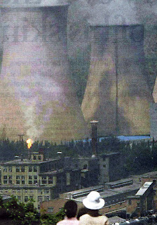
p: With a reduced inclusion of the more clearly defined and brightly coloured foreground figures, the focus is clearly upon the cooling towers.
m: The composition is a little uncomfortable - it looks as if the bottom of the image has been cropped accidentally.
i: The figures and the viewer share the same perspective.
A close-up detail crop from a piece of my own work:
p: The design of the tattoo, is shown more clearly in the crop.
m: The point of the image, which was to show four people covered head-to-foot in tattoos, has been lost.
i: The image, which looks neat and almost mechanical in its original form, appears roughly rendered and clearly hand-drawn in the crop.

Wednesday, 28 October 2009

100 collages: Exercises in Style / Groundhog Day

Matt Madden's comic artists' textbook 99 Ways To Tell A Story: Exercises in Style presents 99 different interpretations of a brief 8-panel story, an idea taken from Raymond Queneau's Exercises In Style (1947), which features 99 interpretations of the same short story retold in different tenses, and in different styles such as free verse, sonnet, and telegram. Madden likewise retells his story from a variety of perspectives and in many styles, including superhero comic, 3-panel daily, and even as a newly discovered fragment of the Beyeux Tapestry. Here are three examples:

Original template.

Humour.

Subjective.

So, inspired by Matt Madden, and the cropping and image workshops from earlier this term, I've decided to use a single image for my series of 100 collages, and to see if I can produce 100 variations based upon the 10 themes. And rather than take an image randomly from a newspaper or other already available printed source, I've chosen to use a still from the 1993 existential romantic comedy Groundhog Day, in which Bill Murray relives the same day over and over again. After watching the whole thing several times I've realised that it's not a great-looking movie, but still I've managed to weed-out a dozen or so candidates. Here are a three of them:

I'm aware that this may end in a snivelling admission of defeat, but I think it's worth a go. 100 is a big number, but 10x10 doesn't sound so bad...

Wednesday, 21 October 2009

Text & Image: Erase & Overprint


The cover of this 2001 issue of Adbusters, designed by Mike Simons, under guest art director Jonathan Barnbrook. the design features a cosmetics advert obscured by the scrawl of a black marker, with the masthead and issue title confined to the periphery of the image. Adbusters can often be a bit 6th-form agit-prop, and I'm not a huge fan of Barnbrook's work, but this cover succeeds in subverting the format (even for a subversive publication like Adbusters), while still delivering a striking image. The barcode placed over the scrawl is presumably necessary, but also a nice touch.

Recognise these? Published receipts from the recent MPs expenses scandal, in their newspaper-ready censored format. It's symptomatic of Broken Britain, I tell you...

...and here's the same trick, this time used for dramatic effect in Joseph Weisberg's novel An Ordinary Spy. The novel hasn't really been censored, but portions of blank text are included by the author as a plot device, and to make the book resemble a real CIA memoir.

Next, two posters by Daniel Eatock, from exhibitions at...


Artist Jérôme Saint-Loubert Bié invited 13 other designers to produce two images each, to advertise his exhibitions at Atelier Cardenas Bellanger and Galerie de Multiples in Paris in 2007. In a cunning (and some might say work-shy) twist, the images would also compose the sole content of the exhibition.
Daniel Eatock chose to mimic Jerome's brief, and rather than produce an image himself, he appropriated the images produced by the 12 other designers, overprinting them one on top of the other to create his own designs. So while Eatock's first poster is composed of the original 12 designs, the second is his own poster from the first show, overprinted with the 12 new designs for the next exhibition. That's an accumulation of 24 layers, most of those individually containing 2 or 3 layers of colour. I haven't seen a copy of the original poster, but I bet it's thick!
Bié's opinion of Eatock's contribution was that it "raised the stakes of this experiment - it is the contribution that is the closest to something I would have done myself." Job well done then.

Dan Walsh's Garfield Minus Garfield removes the eponymous feline from the original cartoons, leaving long-suffering minder Jon Arbuckle alone to stew in his own neurosis. The results are certainly much sadder, and in some cases funnier than the originals.
Originally created to be shared between a few mates in Dublin, the site's popularity snowballed, and for a short time received up to 300,000 hits a day from as far afield as the US. Commentary followed in both the New York Times and the Washington Post. Word soon got back to Garfield creator (and copyright-holder) Jim Davis... and happily, he loved it!

Final example, a classic - here's a video of Robert Rauchenberg and some other talking heads, on his Erased de Kooning Drawing (1953).

It strikes me that there are so many places to take this research (graffiti would be a good one to look at), and I can think of several other artists who use erasure as a central theme or technique - Paul Pheiffer, Idris Khan, and Gary Simmons - but this post is getting a little long and art-heavy as it is. So finally, there's some very interesting further discussion in a series of posts on Stoffel Debuysere's Diagonal Thoughts blog, including some stuff on Garfield.

Research - Street Level


Until the end of the month Kemistry Gallery in Shoreditch is exhibiting a show dedicated to pioneering design journal Typographica, which ran for almost 20 after its launch in 1949 by Herbert Spencer. Curated by Rick Poynor, founder of Eye magazine and author of Typographica (2001), an earlier book about the journal, the exhibition features original copies as well as excerpts from articles along with commentary by Poynor himself.
The article that really caught my eye was Robert Brownjohn's photo-essay Street Level, which features images of type from shop windows, roll-shutters, and hand-written notices, that has in each case been accidentally distorted by use or circumstance, with corresponding examples of deliberately manipulated type produced by designers.


The article reminded me of something I came across a few years ago - ENDCOMMERCIAL is an ongoing research project and photographic archive of images by Scheppe Böhm Associates, which uses a devised taxonomic system (see top image) to record re-occurrent phenomena within an urban environment (in most cases within New York City). The project has so far yielded over 6,000 thousand photographs, a book EndCommercial: Reading The City (2002), and several exhibitions across Europe and the US. The examples above show the giant letter A-shaped temporary barrier supports used by road-menders, the cryptic street markings left by surveyors of under-street pipe-work, and in a direct coincidence with Brownjohn's essay, degraded and misspelt commercial signage. The website actually isn't great for images, but does contain links to numerous essays and articles about the project.

*More images of the Typographica exhibition and the journal itself are available here

Monday, 19 October 2009

Context: re-edited film trailers (good ones!)

I mentioned in a previous post that re-edited film trailers tend to be very bad, relying too heavily upon subtitles and toilet humour. Well to my surprise I've found some examples worthy of attention, each of which is true to the intended format, well put together, and manages to steer clear of knob-gags. While this has not much to do with graphic design per se, it's a very good a example of how context and editing can affect a message.
How about Stanley Kubrick's creepy psychological horror The Shining, as a romantic comedy...
...or musical West Side Story as 28 Days Later-style horror...
...or (and this is subtler than you might expect) Fight Club, in the style of Brokeback Mountain...

Saturday, 17 October 2009

Letterpress: part 1


Cut-short by a fire alarm, our first letterpress session consisted mainly of an introduction to the terminology of the trade - Picas, Beards, Shoulders, EM and EN spaces, and my favourite, "The Stick"; illustrated above, held in the correct manner (letterpress is harder than it looks, and just as time-consuming!)
We each set our name in Baskerville 12pt, ranged left, on an 18 pica measure. Here are the results from the proofing press -


And here are some images of the studio itself -


We have another 3 sessions to go, but in the meantime I've been looking at examples of what letterpress can be used for. Here are some of the best I've found...

...including works with a traditional feel by Douglas Wilson...

...and Kelli Anderson...

...some very crisp greetings cards by The Sycamore Street Press...

...and a kind of Otl Aicher-inspired retro-futuristic approach by Gavin Potenza. Lovely stuff.