skip to main |
skip to sidebar
 I won't attempt to add to the reams and reams already been written about the design of Penguin Books, from the systematic approach defined by Jan Tischold during his brief stint in charge of typography and production, to the distinctive design of books in a particular series, such as these examples of popular fiction, science, crime, and science-fiction from the 1950s to the early 1970s. Its the consistency of the design within each series that appeals to me as much as the styles involved. For example the restricted green and black colour palet and simple-but-striking, Saul Bass-like illustration of the crime series. There are numerous archives of Penguin covers online, but particularly worth a look are the Pelican Project by Things Magazine, which organises the covers by decade, and Joe Kral's personal collection.


First came Redbull. (I'm going to overlook Lucozade, in its traditional form, and Irn-Bru because they pre-date the energy drink boom by many years. By the way, Scotland is the only place in the world in which Coca Cola is outsold by a local soft drink, that soft drink being Irn-Bru, of course. First brewed in 1902, and so named "Irn-Bru" in 1946, decades before txt spk was invented, the popular orange beverage contains o.oo2% Ammonium Ferric Citrate, a food additive that contains iron).
...okay, so. First came Red Bull. Based on a Thai drink named Krating Daeng, Red Bull is a vile-tasting drink in a small can, that contains caffeine and taurine, which is famously an derived extract from bull's testicles (it's not really from bull's testicles). Red Bull was marketed in a small can. The small can is important here, it serves the practical purpose of administering a smaller dose of these mind-altering chemicals, but also signals to the consumer that Red Bull is not just another soft drink. The small can says "I am a serious proposition. I am full of good stuff, that will make you feel amazing, but you have to be careful with me, for I am also powerful." And maybe it signals exclusivity as well. Or it used to, until the rest of these suckers got in on the energy drink market and ruined everything.
 After the other drinks that looked just like Red Bull, came the BIG CANS. The big cans refused to play by the rules. They forever moved the goal posts by repositioning the concept of "energy drink" as something that could be chugged indiscriminately, perhaps by extreme sports enthusiasts looking to take it to the next level, or perhaps by builders on their way to work, instead of breakfast.
 Also aimed at the extreme sports fans (not necessarily the participants) were beverages packaged in the mould of industrial floor cleaners, because industrial floor cleaners and protein shakes have basically the same packaging anyway, and are pretty much interchangeable.

 Brands like Monster the appeal to the meatheads too, but also seem to go after teenage heavy metal fans. Check out this seriously horrible section of their website if you're having trouble imagining what I mean by this. Mouse over the guitar and it plays a riff! Shiiiiiiit!
 ...this brings us conveniently on to the tattoo drinks, as represented here by Relentless, Rubyy, and Full Throttle. Relentless have actually gone so far as to create/sponsor/hijack a film, Lives Of The Artists, which features, in three segments, profiles of a surfer, a mountaineer (not like the bearded union jack touting mountaineers of old, but the contemporary x-treme kind, who like to leap off their mountains after climbing them), and Watford's finest hardcore punk band, Gallows. The band's insanely tattooed front-man Frank Carter is about as close as Relentless could come to a living, breathing advert for the goop they're pedalling - he looks just like a can of the stuff, and, oh yes, he's mental.


 With a more spiritually aware take on a similar aesthetic, are the herbally-flavoured, mist-swathed brands like Mana and Gloji. Both have vaguely mystical-sounding names and secret ingredients derived from various kinds of rare tropical vegetation. The manufacturers of Mana even refer to their product as a "potion". Gloji at least has an award-winning bottle design on its side. In fact, I'm being a bit unfair lumping them together like this. Gloji probably has more in common with other more (and I'm using the term loosely) sophisticated beverages, such as Purdeys.

 Then there are the drinks endorsed by celebrity muscle-cubes Hulk Hogan and Steven Segal. One Amazon reviewer of Segal's Asian Experience, describes the drink as "so horrible it brought tears to my eyes", while another boldly admits how "my penis got smaller but it really helped with midterms". 1 in 3 Trinity goes a step further though, as the only energy drink to be endorsed by Jesus! Low in calories, and containing a "special blend handed down from the flourishing vines and trees of the Holy Land", the brand appears to be cynically aimed squarely at Christian fundamentalists and confused teenagers (I see a pattern emerging here with the confused teenagers).


 novelty drinks like Cocaine, Battery, and Bomba, which comes in abottle shaped like a grenade and has a ring-pull top. Bomba has an odd website with a homepage that plays funk bass, and a picture of a naked couple locked in some kind of wrestling embrace. By the way, Cocaine does not actually contain any real cocaine, however it does have 350% more caffine than Red Bull, and, according to its manufacturers "tastes like a fireball, a carbonated atomic fireball".


 So that brings us back to the issue of can size and to the latest development - the shot. In a pleasingly symmetrical fashion, the drink that began with the stuff Thai lorry drivers consume to help them stay up all night, has returned to its original format. The idea that less is more, that if Red Bull which comes in a small can is powerful, then Red Bull which comes in a tincture the size of a baby's fist must be really powerful. Plus the new packaging is of a convenient size to secrete within your utility belt and the myriad pockets of your extreme sports jumpsuit.
What will be next, I can't say. Perhaps consumers will get tire of being so juiced-up the whole time, and want a drink that will help them have a nice lie down instead. There'll probably be a product called Heroine within six months.


 How do you market something that is, in most places, naturally abundant, and free. This sounds a bit like one of those "if a tree falls in a forest, but no one is around to hear it fall...etc, etc." philosophical problems. Granted, in many countries clean drinking water is hard to come by, but the bottled water market in Europe and the US is just as strong as elsewhere. So strong in fact that bottled water is now a global industry predicted to be worth over $85 million by 2011. But how did this happen? And how do new brands differentiate themselves in a crowded market place?

 Do you abide by industry-standard of blue bottle for still, green for sparkling, perhaps with the addition of some vaguely watery, natural imagery, like the Evian mountain-tops, or the Highland Spring babbling brook? Or attempt to fashion a classic brand like San Pellegrino? (actually that might be tricky - according to San Pellegrino's website, the brand originated in the year 1250, and is officially endorsed by Leonardo Da Vinci). So, what are the options...?
 Option 1: blind them with science! Or not, as the case may be. Ogo is one of a number of hyper-oxygenated waters, containing 35 times more oxygen than regular water. Apparently there is no scientific evidence to support Ogo's claim that their product "serves as an energy booster, revitalising concentration, reflexes, and memory", but then, perhaps surprisingly, the company offers none, relying instead upon the popular conception that oxygen and water are good for you, so oxygen + water must be really good for you. Still, the "oxygen molecule" bottle designed by Parisian firm Ora-ito, is a winner, even if it must be a bitch to stack in a fridge.

Neau is an interesting one. Sold in the Netherlands, for the same price as a bottle of mineral water, Neau is actually a range of different designs of empty bottles, each containing a flier with information about the product... or lack of it. The idea is for the consumer to fill the bottle from the tap, keep hold of it, and refill when necessary. In other words, its a way of encouraging people to drink tap water. As if that isn't worthy enough, all the profits go to environmental causes. Menno Liauw, of Amsterdam-based advertising bureau Vandejong and Stichting Neau (the Neau Foundation) explains "we sell conscientiousness and social responsibility".
 "Starting life at London's top hotels in 1989", Ty Nant is hotel water for yuppies, with a Gandalf-sounding Welsh name. Still, Ty nant (meaning "house by the stream") is remarkable from a design perspective for both it's award-winning cobalt blue glass bottles, and the asymmetrical plastic bottle pictured here, which was created by Ross Lovegrove to "evoke the fluidity of water".
 Ty Nant produce another mineral water named TAU, which, from the design of the bottle, looks a bit Japanese, but is apparently just as Welsh. Designed seemingly to plug a hole in the market of hotels that don't like Ty Nant's blue and red glass bottles, TAU takes its name "from an ancient Welsh word for ‘to be silent’, TAU Spring Water is specifically designed for outlets such as designer hotels, restaurants, bars and cafes where colour may not be appropriate but purity, quality and elegance are essential."
Belu claim to be "the UK's first carbon-neutral water", thanks to off-setting, eco-friendly production processes, and compostable bio-bottles made from corn starch (although these are the up-market glass version picture above. The plastic ones have pictures of icebergs and penguins on them. Ahhhh.) Like Neau, Bleu is a only non-profit organisation, with all profits donated to clean water projects. They even go so far as to claim that "every bottle you drink gives someone clean water for a month". How's that for emotional blackmail?

Drench, owned by UK soft-drinks company Britvic, is aimed at the 16 to 24-year-old youth market. There's nothing particularly different about the product, or even the way its presented (the name is the most obvious thing so far, which I suppose sounds a bit sexy or frivolous, and might appeal to the average Skins fan), though their new jazz-hamsters advert is poking about in the right area. Fiji Water. Oh dear, oh dear, oh dear. Someone in marketing came up with a great idea - exclusivity is the buzzword here. Fiji Water is "untouched by man", produced "Far from pollution, far from acid rain, far from industrial waste" and shipped thousands of miles to its consumers in Europe and the US. Fiji have responded to accusations of supporting a military dictatorship, involvement in political shenanigans, and of course responsibility for the devastation of the environment, courtesy of an elephantine carbon footprint by greening-up their act with claims that "the production of each bottle will actually result in a reduction of carbon in the atmosphere". There's also some gumf on their website about "investing in local Fijian communities" to off-set the detrimental effect of diverting clean water from local usage, for the company's exclusive access via a "17 mile-long aquifier", whatever one of those is. "Lipstick on a pig" was one critic's response.
Bling H20 is the brainchild of (no joke) "Hollywood writer-producer" Kevin G. Boyd. Click on his name there to see his list of Hollywood credits.. oh, there aren't any? I wonder why that is..? Kevin presumably thought-up Bling to give him something to talk about while sniffing coke off a hooker's arse at his friends house parties, or perhaps because an inner voice told him "you can tell a lot about a person by the kind of bottled water they carry". Like, for example, if they're an insecure narcissist who thinks that paying FIFTY DOLLARS for a jewel-incrusted water bottle will mean they end up sitting next to Brad Pitt at the Oscars. And don't just take my word for it. What. A. Tit.
 Project 7 Purified Water really milks the "it's for a good cause" argument. The texas-based company also produces t-shirts, gum, and mints, which are branded with a range of 7 worthy causes - Build the Future, Feed the Hungry, Heal the Sick, Help Those in Need, Hope for Peace, House the Homeless, and Save the Earth. Half (only half?) the profits from any product go to a charity in suppport of the cause promoted on the label. So, for example, if you want to help "Build the Future", but you don't like homeless people, you can choose where your money goes.
 Tap'd NY is, as far as I can tell, unique in being the only bottled water that specifically markets itself as coming from a tap. Available only (or should I say, exclusively ) in New York, the water is purified through a process of "reverse osmosis", and shipped to the streets in robust-looking bottles bearing quotes like "no glaciers were harmed making of this water" and "bottled water without the funny accent". As their strapline "Truth in Hydration" confirms, the brand aims to lay its cards upon the table - challenging the naysayers with the argument that while it may only be tap water, it's the finest tap water in the world, and it doesn't harm the planet in getting to the consumer. See, this is a very canny product that manages to appeal to a sense of civic pride, environmental consciousness, AND the tourist market simultaneously. They even have a street team of Hydrators, who dress like Ghost Busters and will refill your bottle for free.
 While we're on the theme of local findings, here's another photo I've had on my phone's memory stick for a while. This appeared on a hoarding next to Clapton Pond. I found out recently that the author was local artist Shane Deegan, who intended it as a riff on the Clapton is God graffiti (in this case Eric Clapton) that appeared in Camden in the 60s.
 A spate of murders and some creative media headlines between 2000-02 earned Clapton the nickname Murder Mile, and the area's notoriety had achieved nation-wide acknowledgement by the time it was named by Channel 4's Property Ladder as the worst place to live in Britain in 2006 (the show featured a shot of the block of council housing in which my friend Jill lived. I've never seen her so proud of anything before or since).
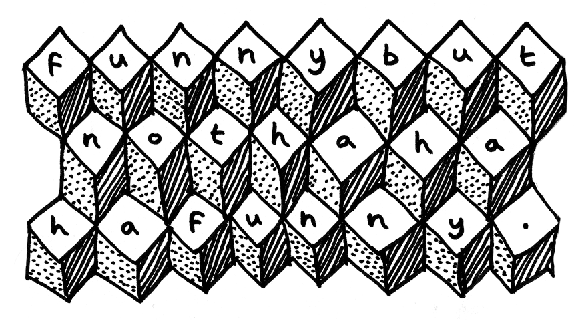
The Arts Council may well bang-on about inclusivity and "engaging the community", but I'd be impressived if anything inside a local gallery managed to reach half the number of people this did (the 38 is a popular bus, afterall). It's simple, funny, optimistic, and gently self-mocking.
The grafitti lasted only a week or two, but was another soon too its place (not one of Shane's, according to a local blogger known as Fat Hands), suggesting the message found sympathetic ears. Clapton is good, I might even go so far as saying it's Super Good.

 I won't attempt to add to the reams and reams already been written about the design of Penguin Books, from the systematic approach defined by Jan Tischold during his brief stint in charge of typography and production, to the distinctive design of books in a particular series, such as these examples of popular fiction, science, crime, and science-fiction from the 1950s to the early 1970s. Its the consistency of the design within each series that appeals to me as much as the styles involved. For example the restricted green and black colour palet and simple-but-striking, Saul Bass-like illustration of the crime series. There are numerous archives of Penguin covers online, but particularly worth a look are the Pelican Project by Things Magazine, which organises the covers by decade, and Joe Kral's personal collection.


